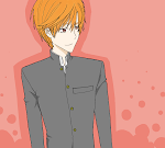
In in some kind of art slump right now because I can't seem to get myself to work on something I specifically want so lately I've been doodling a lot. Whilst all the doodling, I still try to remember to practice on my colouring and shading. my lineart is still a wreck though. I can't seem to perform as well in SAI as I did in PS
That aside, I found a new activity that is fun to do and can help improve on the shades a bit~
So I made a tutorial! In case I forgot lol
So let's get to it then!
First and foremost!
I shouldn't have to do a tutorial for that as well, do I?
Let's start!
You can see that I've started to define the folds in the clothes. That's why I keep the brushes at low opacity most of the time. It's easier to shape them like that.
And we're done~! That's about it really. It's quite fun actually. I wouldn't mind doing it again lol.
I hope it helps somewhat ^^;
That aside, I found a new activity that is fun to do and can help improve on the shades a bit~
So I made a tutorial! In case I forgot lol
So let's get to it then!
First and foremost!
SketchNothing interesting about this one...
LiningI decided to give it a bit of the inking. I do miss doing linearts like this. For some reason, no matter the thickness of the point, it'll feel cleanest if I do this type of lineart lol.
I shouldn't have to do a tutorial for that as well, do I?
place a dark colour as the backgroundIt is advisable to choose a colour that has a lighter tone than the lineart (if you are the kind to not use black lines, like me) Although I named it base colour, the colour you choose will also act as a shadow since you will be playing with the highlights.
It will look like thisNow we're moving onto the actual shading!
Let's start!
Choose a lighter toneThis is basically how I choose the colours. See the arrows I drew above? That's the general direction to choose the colours. Likewise, when choosing darker tones, you just move it in the opposite direction. The colour mixer might look different in PS and in SAI but it works just the same way.
First shadingI chose a colour that is nearest to the bg colour for this. Notice how I kind of coloured both characters completely? I wanted to show that their shirts are light coloured. I will be layering on more shades on parts that should have lighter colour or that will definitely be facing the light source. If you squint (or click on the above image to see its full version) you'll see that Hibari's (the guy who's slightly out of frame)shirt is coloured more while his jacket is coloured less. This is because his shirt is of light colour (white) while his jacket is of dark colour (black). Despite it being black, it will still need highlights to show where it faces the light source, right?
The setting for the brushI let the opacity remain mostly within 20%-40% and use the blur tool a lot. It's not impossible to do the same in PS. Keep the opacity just as that and keep the blur tool at a high opacity (perhaps 50% to 70%)
2nd shading and light sourceI'm just showing the general direction of the light source. You don't actually need to draw arrows like that (but if it helps you, go on)
You can see that I've started to define the folds in the clothes. That's why I keep the brushes at low opacity most of the time. It's easier to shape them like that.
3rd shading, more shapingAround this part, I've also started using a low opacity eraser to define the shadows. I have the erasor at 10% opacity.
final highlighting and shapingIt's okay if you colour outside of the lineart. We'll be cleaning that up next.
Erase unneeded shades
Add shadowsI know I said we'd be playing with highlights but some places do need to be darker. but I only use one dark shade to do his pupils and some more shaping in the folds.
Adjust the colours
And we're done~! That's about it really. It's quite fun actually. I wouldn't mind doing it again lol.
I hope it helps somewhat ^^;


0 thoughts:
Post a Comment